| Lost Vegas: Art by Janet K. Lee |
Artist Janet Lee and story-teller/author Jim McCann have teamed together again (Return of the Dapper Men, Archaia 2010) and created the absolutely awesome Return of the Dapper Men.
Lost Vegas. published as a miniseries through Image Comics, debuted March 6th amidst much fan-fare and rave reviews.
While this miniseries was rumored to have originally been about "a day care center in space" it morphed into a science fiction heist story although McCann, in a Comic Book Resource Interview noted that "...we reserve the right to return to Lost Vegas, The Day Care Center if this book is a hit. Just sayin'..."
Overview:
Lost Vegas' basic story centers around one cocky gambler - turned galactic slave to cover his table losses - who plans "the greatest heist [and escape] the universe has seen." In this story, Roland our 'gambler slave (whom McCann describes as: "...Paul Newman's character in The Hustler...pressing his luck with the ego Hans Solo had in his early days - the 'No way can I get caught' mentality") pairs up with awesome aliens developed by Lee (including a ten-foot stag and an alien who serves as a sentient link between 'the accomplices', to create their heist/escape of the millenium. And then there's Kaylex, a mysterious dancer in Issue #1, with the potential of being Roland's femme-fatale.
The story line and art clearly reflect the benefits of collaboration as each enhance the other. You can see, hear and feel the energy and adrenaline rush of the casino floor and its shows meant to distract, while realizing that for all the 'wins' on that floor, there are devastating losses.
Note to readers: This is not a fast read because you need to feast on the words and images reflecting the overwhelming genius of the McCann-Lee partnership. The images in particular are rich with detail and background and while set clearly in the future, the reader can't help but think of how Ocean's Eleven meets Star Wars and certain Star Trek episodes - with healthy doses of The Italian Job and The Hustler.
One really cool factor about the art is that the gambler-slaves, who come from all over the galaxy wear a slave-shackling collar that when they 'serve' on the floor is turned on, changing their appearance to one look. At the switch of the collar button all aliens appear as a non-descript man. One of Lee's challenges was to distinguish our 'hero' Roland from the others when he's on the floor (and not underground in his cell)...and she does it brilliantly - but, you'll have to see how she does this on you own. I won't spoil a thing.
While the first issue is PG13, this read is basically for teens and above with the rest of us hoping the younger set gets to see the eventual surfacing of what sounds like an awesomely bizarre Lost Vegas: The Day Care Days.
So here's a glimpse at Lost Vegas (well worth a closer look on your own):
In this image, Janet Lee takes the Star Wars bar scene to the limits in her Lost Vegas Art:

And here are some reactions:
"Lost Vegas #1is an overwhelmingly successful feat of storytelling and a visual smorgasbord...[giving us] a one-of-a-kind experience, rooted in familiarity, that surpasses whatever we were capable of expecting." Posted by Sam Lebas on Image Adiction - 3/4/13
And infanboy.com has voted the cover and cover variants being offered in exclusive Issue #1 copies as "Best of the Week." Take a look:
Cover choice #1
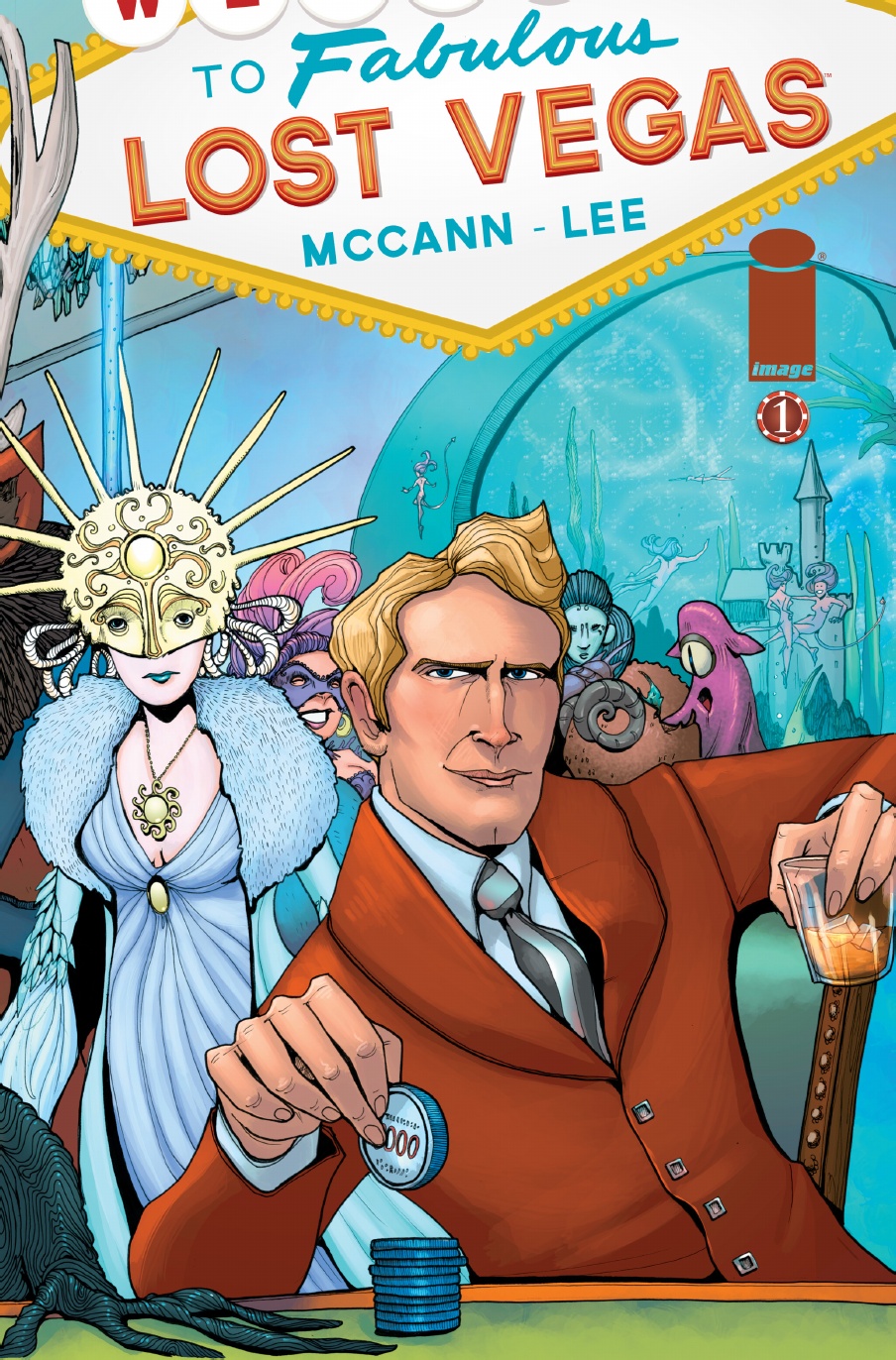
"Best of the Week in Covers" 3/6/13 posted by Paul Mongomery on ifanboy.com voted the image above (drawn by Janet Lee) as his first "Best of the Week 3/6/2013" entry and wrote: "Note the steely poker face. Note, too, the spectacular shawl syle lapels, the square buttons of his rust orange jacket. I also enjoye the intimate hook of the first person perspective. We're the dealer or some opponent engaged in a very high stake game. I love a cover that poses a triple dog dare."
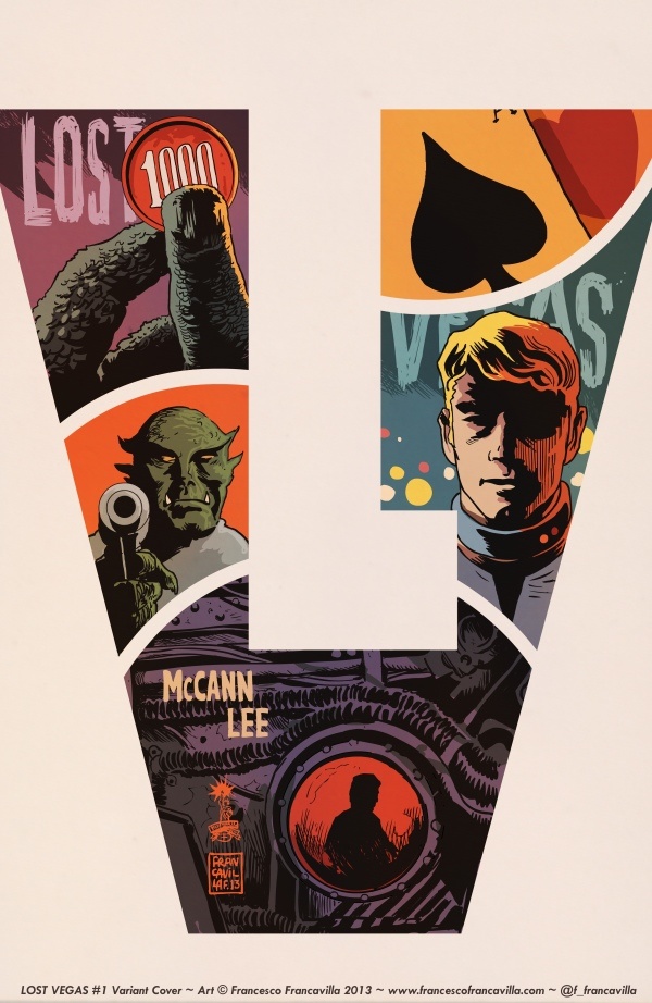
Cover Choice #2:
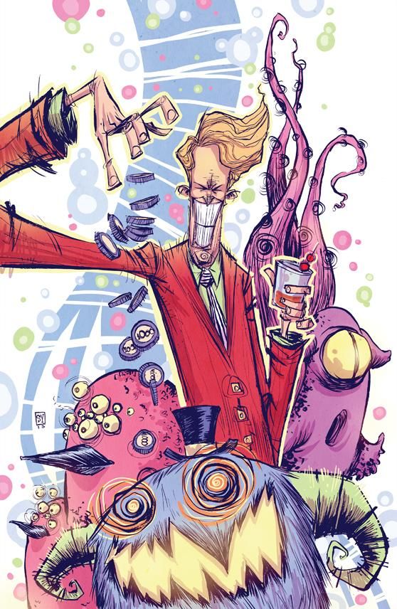
Cover Variant #3:
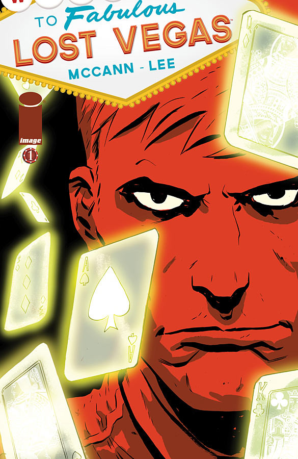
Cover #4:
So.... what cover do you like?...Have you read Lost Vegas yet?
Let us know in the comments.
In the meantime, thanks for your visit. I hope to see you back soon.
I haven't read it but I like Variant 3 the best. They are all good. Carver, ABC Wed. Team
ReplyDeleteI like the idea of "slow" reading. It's like the difference between fast food and slow cooking.
ReplyDeleteROG, ABC Wednesday team
This intrigues me. I may have to give this a look-see, especially for the illustrations.
ReplyDeleteI call myself Reader, but I noticed that I am a slow and lazy reader. If the book is too voluminous I don't even start if the subject doesn't interest me. I had to read so many books during the time I studied,that I was glad this period was over and done with.
ReplyDeleteI must say that I hardly read any Dutch books. I only read English, but I didn't read "Lost Vegas".
Thanks for your visit, Meryl.
The illustrations are truly awesome - a feast for the eyes and mind. Let me know what you think.
ReplyDeleteI've never heard of it, but I like the first cover best.
ReplyDeleteLeslie
abcw team
Another great post for 'action' readers ~ Very informative and educational for tweens and teens ~ Enjoy ^_^
ReplyDeleteNever seen this book either, but the photos look amazing!!
ReplyDeleteHappy WW :)
I love the illustrations!!! I'm sorry, but usually I do judge things by their cover (that being the art). I'm a college Graphic Design Instructor; it's in my nature to judge. Anyway, this one looks good.
ReplyDeleteThose are all very creative illustrations. But I vote for Cover #2. I like overlapping of the L and V in it - kinda like a logo waiting to happen... Also, each "scene" entices me to find out what's it all about!
ReplyDeleteSometimes when a book interests me, I don't want to stop.
ReplyDeleteJanuary
Catching up (again) with this week's entries.
Rose, ABC Wednesday Team