[SPOILER ALERT: This post will detail how we learn to see and illustrate the power of optical illusions...but if you don't have time for all of it, skip to the final video clip which will blow your minds - at least it blew mine.]
Understanding Optical Illusions and the Power of Visual Literacy:
When learning to see, read, or interact with the world around us, context is integral to understanding. Context helps prime the brain to anticipate what is coming, usually making processing faster and more efficient. We do this all the time with reading. While research now shows that we 'look at' and process each letter as we read, our brains process the shape evaluating "probable' letters and constructing 'probable' words and content. This is why it is so important to preview new materials when teaching. When we our brains 'think' it is one letter or word and it doesn't make sense, more attention is given to the visual cues and reading slows down. Context is also essential when viewing/interpreting images and it is context that creators 'twist' with optical illusions.
Here's how CONTEXT helps us learn how to see:
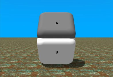
You can take identical squares and surround them in different colors and they will 'look' different. In this example, the surface color of squares A and B are identical. Cover the seam where squares A and B meet, and you'll see (wait a few seconds for your eyes/brain to adjust).
 |
| From: http://brainden.com/color-illusions.htm |
- Color Casts Powerful Messages: Learn How to USE it!
- Light Contrast Illusions
- Color Illusions
- Color Context and Simultaneous Contrast
- Beau Lotto: Optical Illusions show how we see
But, there's a lot more to context and learning to see than color cues.
Gestalt theory addresses many of these issues formulating that the unified whole of an object we 'see' is more than the sum of its individual parts. Gestalt theorists originally identified five key principles (and later added a sixth) that influence how we 'see' when we look at images:
- Figure/Ground - we tend to separate forms in an image, focusing on "dominant wholes" while pushing other parts of the image into the background. We do this with the optical illusion of the "old hag/young woman" for example. In this image we can push the old hag's face and white hair forward or place the young woman's brown hair and hat with feather forward pushing the old hag's features in the background. Camouflage works under this principle as well. The material's meandering lines of mottled-colored patterns disrupt our brains by trying to hide the contour or outline of the body or vehicle.
 |
| From: http://kids.niehs.nih.gov/games/illusions/ |
 |
| From:http://jeffbrew.com/2012/02/26/howto-gestalt-principles-and-photography/ |
- Proximity - we tend to group objects together based on their placement or proximity. So, objects or shapes that are close to one another appear to form groups. Fruit in a bowl is perceived of as "fruit" and not "one banana, one apple, one apple, grapes, one orange, and one more apple." In the example above, the proximity of dots and dark spots become a 'dog':
 |
| From: http://gestalttheorysam.blogspot.com/2011/02/6-principles-of-gestalt-theory.html |
- Similarity - we tend to perceive forms with similar characteristics (size, color, shape, etc.) as a group. The more alike the items are, the more likely they are to form groups. As dissimilar as they are, our minds will conversely resist grouping them together. In the image here, there are two different shapes that are grouped to form a pattern. We group the squares together to form a cross surrounded for four groups of circles. In this case, the square is the figure and the sets of circles are the ground.

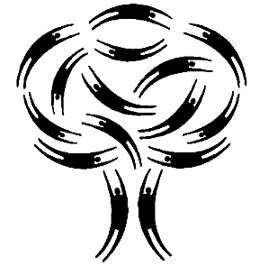
- Closure - we tend to 'fill in' information in images which appear incomplete to us. We do this when reading or writing (and unfortunately sometimes when editing): we often won't recognize if letters were missing because we tend or prefer to see words as complete entities and not as individual letters. Scott McCloud (Understanding Comics) discusses how our brains automatically want to make shapes into human (or recognizable) forms. In the image here, we see the swirls of 'people' as a tree because our minds focus more on the continuous 'movement' of the people, and close them into one complete image

- Continuance or Continuity- we tend to continue shapes beyond their ending point as the edge of one shape will continue into the space and meet up with other shapes or edges of the picture plane. Continuance in the form of a line, an edge, or a direction from one form to another creates a fluid connection among compositional parts. Here are three factors that contribute to continuance:
- Some have added a sixth principle of Symmetry - when we perceive objects we tend to perceive them as symmetrical shapes that form around their center. Furthermore, the principle of symmetry work particularly well when framing photos and images. People are accustomed to receiving information in a systematic and organized manner and tend to avoid material that requires too much work to process and comprehend. A symmetrical design will create a sense of equilibrium and balance while an asymmetrical design will cause tension. Often, however (especially with images), the tension created makes the image more interesting and less 'boring'(see the photo below). The goal is to structure you images (and your text) to be easy to follow but not overly predictable and engaging with some nuance, twist, or hook to keep your audiences attention.
 | |||||
| From: http://jeffbrew.com/2012/02/26/howto-gestalt-principles-and-photography/ |
NOTE that while I have given you visual examples of each of the gestalt principles, many images use multiple principles to successfully work as optical illusions.
For fun, here is a link of optical illusions in photos from Bored Panda with some of my favorites below:
1. Camouflage art by Wilma Hurskaninen (link)

2. French landscape astrophotographer Laurent Laveder shows how some simple props and a bit of imagination can turn the moon into anything you like. (link)

3. A work by Japanese artist Makoto Aida titled AZEMICHI (a path between rice fields). (link) which clearly illustrates the principle of continuance.

The artist Maurits Cornelis Escher is famous for his optical illusions which integrate most of the gestalt princiiples:
 |
| Relativity, 1953 |
Drawing Hands, 1948

But there is even more to learning to see than gestalt and color... some images become so familiar and universal, they become symbols or icons. Just the way we learn to use the alphabet and sight words to help us read, we use icons, signs and symbols to help us see. A car's dashboard, for example will show an icon to tell us to change the oil, close our doors, secure our seat belts, when we need gas (and on what side of the car we will find the gas tank) and so much more:
| From: depositphotos.com |
Playing with optical illusions provides us with experience in learning HOW to interpret complex images. The more we experience, the more flexible we are in interpreting what we see.
 |
| From: http://kids.niehs.nih.gov/games/illusions/ |
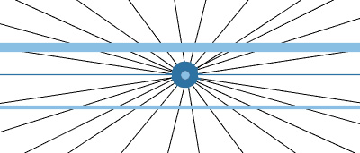
The Hering illusion is an optical illusion discovered by the German physiologist Ewald Hering in 1861. The two horizontal lines are both straight, but they look as if they were bowed outwards. The distortion is produced by the lined pattern on the background that simulates a perspective design, and creates a false impression of depth. Note that the thinner line appears more bowed than the thicker line.

In closing, here is a literally 'mind-blowing' video illustrating HOW are minds are trained to interpret images a certain way, and how confusing it is for us when we 'see' one thing but our mind 'understands' what we see in another way entirely. Below is a video that the mind (at least my addled mind) just can't grasp - illustrating how important the 'literacy' segment is of visual literacy
For more fun, brain blasting and brain training please visit these cites:
- National Institute of Environmental Health Sciences Kids' Pages: Illusions
- Principles of Gestalt Theory
- How to: Gestalt Principles and Photography
- Gestalt Principles
- Visual Phenomena and Optical Illusions
- Visual Neuroscience: Optical Illusions
Thanks for your visit this week. Please leave your favorite optical illusions or any other reactions, suggestions, and/or questions in the "Comments."

Thanks for the interesting read on optical illusions. I pinned a few of the pictures.
ReplyDeleteMeryl, I think you have outdone yourself on this post.
ReplyDeleteI found it fascinating and the video at the end really explains the theory.
Thanks so much.
Marvellous, very interesting. I absolutely admire the works of Escher!
ReplyDeleteAwesome post! I love optical illusions and it was interesting learning more about them.
ReplyDeleteAn Arkies Musings
Tremendous amount of information. I think everyone is fascinated with OPTICAL illusions. Kate, ABC Team
ReplyDeleteI had seen that last video before; it's almost hypnotic.
ReplyDeleteSeems that false perception plays into a lot of our biases, unfortunately.
ROG, ABC Wednesday team
When I taught 4th graders, we studied light and had a lot of fun with optical illusions! Love that video - I think it's gone viral on the net!
ReplyDeleteLeslie
abcw team
Very interesting subject,Meryl! I liked the video at the end. And the drawings by Escher. I have a book about his life and a movie as well.I am a fan of his.
ReplyDeleteThank you for sharing.Have a wonderful week.
Wil, ABCW Team.
Meryl ~ you always have fascinating and educational posts ~ Wonderful for O ~ ^_^
ReplyDeleteSuch an interesting post!
ReplyDeleteHappy WW :)
Interesting photos. I still do not see squares A & B being the same color.
ReplyDeletehttp://joycelansky.blogspot.com/2013/04/ww-meets-atoz-t-taunting-squirrels.html
I've always enjoyed these types of illusions, yet it had been some time since I had seen some, thanks for sharing and bringing back so many great memories.
ReplyDeleteThanks for linking and have a happy WW.
Optical illusions are so cool! In New Zealand I visited an entire museum dedicated to them. I think it was called Puzzling World. It was pretty cool!
ReplyDeleteNatashalh
Those optical illusion posters that were popular a few years ago were a puzzle to me. Try as I would I could not make the 3-D picture embedded in them appear. In addition I will sometimes walk in to a room where the TV is on and when I look at the screen I can't make sense of the picture for a few seconds. It's like looking at a mixed up jigsaw puzzle. I think partly I have a depth perception problem. Interesting though.
ReplyDeleteWhat a wonderfully informative post! thank you. I have bookmarked it for a return visit soon. I appreciate the effort you took on behalf of the rest of us!
ReplyDeleteSG
Those are very neat!
ReplyDeleteOUTSTANDING
Over and over again, I am always late commenting, but, trying to catch up.
Rose, ABC Wednesday Team.
Very interesting post. I look forward to more; love the subjects you cover.
ReplyDeleteBest wishes, Kennedy Creative Works
http://kennedycreativeworks.tumblr.com
THese are cool! I love optical illusions that plays with the eyes. I’ve always wanted to do something like these but never got around to do them.
ReplyDeleteGreat way to brain torture! ;)
ReplyDeleteBut I've always enjoyed these types of illusions.
Identifies examples of data your business considers confidential and how the information should be handled. cyber security hyderabad
ReplyDeleteGraphology Course is the study of handwriting as a means of analyzing character. Also called handwriting analysis. Graphology in this sense is not a branch of linguistics.
ReplyDeleteIf you are looking for Online Grocery Shopping Durgapur, download Bazaar Durgapur App from Playstore. Order Now and get exclusive discounts on combo offers!
ReplyDeletebetpark
ReplyDeletetipobet
betmatik
mobil ödeme bahis
poker siteleri
kralbet
slot siteleri
kibris bahis siteleri
bonus veren siteler
JF7FYX
شركة تسليك مجارى بالدمام
ReplyDeleteشركة تسليك مجاري بالقطيف
شركة تسليك مجاري بالجبيل
شركة تسليك مجاري بالاحساء
شركة تنظيف بالقطيف IdPHqFD5jI
ReplyDeleteشركة تسليك مجاري 8d1CLaC4RZ
ReplyDeleteWhat a fascinating read! I truly enjoyed how you explained the connection between optical illusions and brain function—it’s both educational and engaging. The visuals were especially striking and reminded me of the Hypnotic Patterns Prints Collections I recently came across, which also play with perception in such an intriguing way. Thank you for sharing such a well-written and thought-provoking post!
ReplyDeleteIf you are an ambitious trader looking to scale your results without risking your own capital, then choosing a Funded Account Forex with Winprofx is the smartest step toward professional growth in the trading world. Winprofx provides traders with unique opportunities to access larger trading capital once they prove their skills through a structured evaluation process, allowing you to trade like a professional without the burden of financial risk. With a funded account, you can bypass the challenge of limited capital and focus directly on implementing effective strategies in real market conditions while having the chance to retain significant profit splits. Winprofx stands out by offering reliable trading conditions, lightning-fast execution, and complete transparency, ensuring every trader has a fair shot at achieving consistent profitability. Whether you specialize in scalping, day trading, or swing trading, the flexibility of Winprofx’s funded account programs empowers you to adopt whichever style works best for your goals. Furthermore, traders benefit from a supportive ecosystem with advanced trading tools and educational guidance designed to sharpen skills and reduce common mistakes. By starting your trading journey with a Funded Account Forex with Winprofx today, you position yourself to achieve bigger wins and sustainable growth in the competitive forex market.
ReplyDeleteFunded Account Forex-