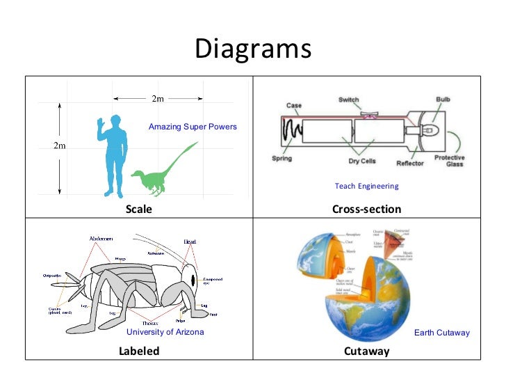
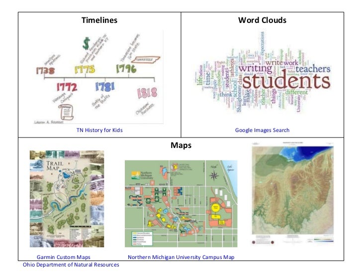
Visual texts typically consist of two - and sometimes three-dimensional representations of information or events that geometrically and symbolically relate a lot of specific information in a given space. They include:
- graphs
- tables
- webs (story webs, character webs, word webs and visual dictionaries)
- flowcharts
- tree diagrams
- network diagrams
- organization charts
- floor plans
- sitemaps
 |
| From: Jessica Fries-Gaither and Terry Shiverdecker's Visual Literacy and Nonlingistic Representations |
 |
| From: http://www.slideshare.net/klightle/visual-literacy-part-1 |
At this point I can picture you thinking: we've been doing this for over 60 years, so where's the innovation? Where's the evolution?
With expansion of technologies, programs and greater emphasis on visual as well as verbal literacy, these images incorporate extensive design elements, are often interactive, and are often more elaborate.
Here's the change and evolution:
- Most classes incorporate various forms of multi-media (because so much is now available over the internet and because research has shown that multi-media, like infographics helps make learning accessible to all kinds of learners)
- Today, these charts, diagrams, word clouds, graphs, tables, webs, timelines and maps are being morphed into "INFOGRAPHICS"
- And, not only are teachers and publishers creating these visual story-telling, fact-finding masterpieces, students are creating them as well.
Take this infographic for example:
 |
| From: http://dailyinfographic.com/getting-around-infographic "Getting Around" by Diego Martinez-Moncada |
You look at this infographic and want to read it [click here to enlarge it]!! In one very inviting image, readers learn about the various means of transportation available today, the most popular means of transportation, the fastest means of transportation, and the volume of different modes of transportation in various countries around the world.
The colors, and interactive links ENGAGE students and viewers.
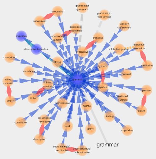
Take one more example. This one is from an earlier post on interactive visual dictionaries (Visuwords or SnappyWords). At these sites you enter a word, for example, "grammar" and you get a webbed image of related words (all of which you can click on and get different webbed images). These images not only provide synonyms, antonyms, and related words, they actually SHOW HOW they're related:
 |
| From: http://departingthetext.blogspot.com/2013/02/expanding-horizons-with-21st-century.html |
How can YOU make Infographics? Read on...
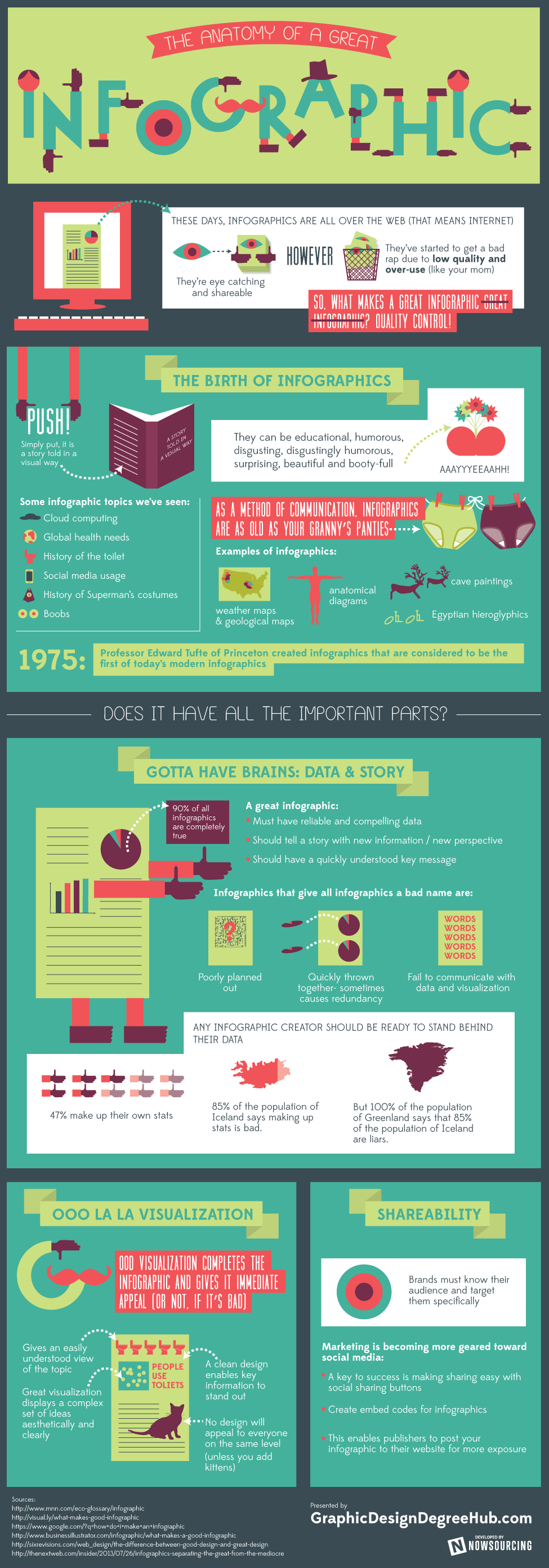
To learn how to read and create infographics, one has to understand the basic elements they contain, and we what better way to do this than through a.... you got it.... through an infographic! The infographic below shows and tells what is needed for "data visualization"
- A particular theme to relay
- A title - informing readers what that theme is
- Key information and data
- Credited sources (to add 'veritas' and...well...credibility) so readers will accept your information
- Colors to not only attract readers but frequently to color code different types of data and themes;
- Fonts to not only attract readers but to also help relay different types of data, information and themes;
- Chart styles (pie charts, pictoral charts, line charts, bar charts) that relay "how many" (bikes are used in cities around the world) or "how much" of the key information recorded
- "Navigational inconography" or in simple terms, arrows and lines to connect the images, data and themes
 |
| From:http://visual.ly/infographic-infographics-0 |
 |
| From: http://www.graphicdesigndegreehub.com/great-infographic/ |
- Wunderground.com
- NOAA
- Smithsonian.com
- http://learning.blogs.nytimes.com/2010/08/23/teaching-with-infographics-places-to-start/?_r=0
- New York Times social studies, science and economics infographics - containing links to their infographics on 2010 midterm elections, Obama's 2011 budget proposal, measuring the conservatism of Robert's Supreme Court, political rhetoric, polling the Tea Party, immigration, gender gap, finance reform, economic recession, unemployment, consumer spending, and the European debt crisis. (http://learning.blogs.nytimes.com/2010/08/24/teaching-with-infographics-social-studies-history-economics/)
- New York Times science and health with infographics includes infographics on diseases and disorders, health care reform, viruses, cancer, smoking, dietary 'do's and don'ts', Gulf of Mexico oil spill, physics of sports, space exploration, climate change, natural disasters, energy, animal migration, particle physics and technology. (http://learning.blogs.nytimes.com/2010/08/25/teaching-with-infographics-science-and-health/)
This is a long post, but I hope you found it interesting and helpful.
As always, I thank you for your visits and hope you leave your reactions or other related resources you may know of in the comments.
Thanks, see you next week.
These are fabulous! I can't wait to explore them in more detail! Thanks for sharing.
ReplyDeleteTina from mommynificent.com
Maybe I'm just getting old, but I find most new-fangled info-graphics simply exhausting to read and often not worth the effort, because more often than not they simply don't contain much information. Conversely, I'm a big fan of Edward Tufte who has written in great detail about what makes a good graph. He calls all that filler "chart junk," and absolutely reviles pie charts. He's well worth a read, and his books are gorgeous. http://www.edwardtufte.com/tufte/
ReplyDeleteWow! Audio-Visual Aids has had a massive makeover!
ReplyDeleteLeslie
abcw team
Will be linking this article to my work blog tomorrow morning.
ReplyDeleteThanks, Roger.
DeleteHi Meryl! Your post is very difficult to understand and beyond my comprehension. I only taught elementary school children, and English for adults who want to speak and understand the most important words. They liked my lessons and could speak the language basically after a year. I created every-day situations, which you can experience while on holiday. I used audio and visual material like tapes with native speakers and movies about the books we read.The problem with these infographics is that there is so much information in a language which is not mine, that I need to use my dictionary all the time. I am not that kind of teacher and my students are not interested in long exercices of grammar. I have the feeling that you teach at a university, and I will never reach that level, let alone my students.
DeleteAll the same: I thank you for the trouble you take to write such a post!
Wil, ABCW team.
Fascinating post. Informational graphics can add so much to the learning experience.
ReplyDeleteFascinating Meryl.
ReplyDeleteI am a very visual learner.
I often wish we had had all the digital tools when I was a child.
Since I am an artist (painter), I am visual, but I hate infographics. Since I am also a psychologist, my opinion is that most of them contain too many stimuli.
ReplyDeleteNot everything that is new or in vogue, should be automatically considered as good, or helpful. It's a good I-word though.
What a lot of great information. For many years I used Mind Maps instead of Lists, and these Infographs really appeal to me.
ReplyDeleteInfographics are becoming popular. They vibrant and very informative.
ReplyDeleteRegards
Regards
Our new post for ABC Wednesday
An Insight Inside Dudhwa National Park
Fantastic description of why infographics are so important. Love it.
ReplyDeleteI have to agree with Jesh though - I often find them too busy. There is much to be said for simplicity.