Thursday, March 21, 2013

Keeping Up with the Neighborhood: Knowledge from Fred Rogers

Note: This post was inspired by a wonderful teacher, Talia Hurwich

"When I was very young, most of my childhood heroes wore capes, flew through the air, or picked up buildings with one arm. They were spectacular and got a lot of attention. But as I grew, my heroes changed, so that now I can honestly say that anyone who does anything to help a child is a hero to me."
From The World According to Mister Rogers (Kindle Locations 501-503).

In an earlier post, "Promoting Expressions of Care...Or... Where Has Mister Rogers Gone?" I posted a clip of Fred Rogers championing public television and his mission of "Expressions of Care"  when fighting bullies, dealing with disappointments, and when dealing with frustration.  I've often reflected on Mr. Rogers and Mister Roger's Neighborhood - how it was so soothing (while on the other hand there were those terribly entertaining SNL / Eddie Murphy spoofs and Jimmy Fallon's more recent spoofs).

The thing is though, that he really did care and we need champions like Fred Rogers so much more today. Interestingly, after the Newton horror, PBS quotes and images of Mister Rogers went viral:
"On Friday[PBS] posted the image and quote ["when I was a boy and I would see scary things in the news....']. since then, the post has been seen by hundreds of thousands of people and shared more than 90,000 times on Facebook." (posted PBS.org "Mr. Rogers Post Goes Viral December 18, 2012)
Fred Rogers so deeply understood the need for compassion towards others to not only build a better world but to better ourselves.  And, he understood the for loving each other as we are and the need for play as learning and not just for a release or reward.  The bottom line is that he knew kids  and the trials and tribulations of childhood and did so much to help build a strong, healthy neighborhood.

It's up to us as adults and parents now to model respect and expressions of care while raising our kids and students.  In honor of what would have been Mr. Roger's 85th birthday (March 20, 2013) and inspired by a super post by Dave Stopera at buzzfeed.com "15 Quotes That Show That Mr. Rogers Was A Perfect Human Being" here is a tribute to and from the ultimate champion of  kids, Mister Rogers:

 On Helping:

On helping:
From: http://www.facebook.com/photo.php?fbid=10151563693650329&set=a.90324480328.112010.21898300328&type=1
On the Importance of Play:
On youth:
From:http://christopherjonesart.tumblr.com/post/45791793119
On play:
From: http://girltomom.com/fumbling-towards-ecstacy/inspirational-quotes/mr-rogers-quote-play
On Childhood:
On childhood:
From: http://www.pbs.org/misterrogers/share/

On Friendship:
On being yourself:
From: http://lemonyandbeatrice.tumblr.com/post/44165978506
On Reflection and a Sense of Humor:
On his show's characters:
via: http://www.tumblr.com/tagged/mister-rogers%27-neighborhood
On Growing and Life Lessons:
On growing:
From: http://abcpastor.wordpress.com/2008/03/19/wont-you-be-my-neighbor/
On Individual Contributions:
On the people you meet:
From: http://www.oprah.com/spirit/Quotes-About-Helping-Others-Quotes-About-Making-a-Difference/9
On What Ultimately Matters:
On fame:
From:http://i.imgur.com/
 On the Power of Love:
From: Kootation.com
And in closing from PBS digital studios:
"Do you ever imagine things?...Did you ever pretend about things?... Did you ever grow anything in the garden of your mind?  You can grow ideas in the garden of your mind... It's good to be curious...All you have to do is think and they'll grow... There are so many things to learn about in this world and there are so many people who can help us learn!!! "


Thank you for your visit.
Please share your memories, quotes or Mr. Roger memories in the comments.

Monday, March 18, 2013

Janet Lee and Jim McCann's "Lost Vegas"

Lost Vegas: Art by Janet K. Lee


Artist Janet Lee and story-teller/author Jim McCann have teamed together again (Return of the Dapper Men, Archaia 2010) and created the absolutely awesome Return of the Dapper Men.

Lost Vegas. published as a miniseries through Image Comics, debuted March 6th amidst much fan-fare and rave reviews.

While this miniseries was rumored to have originally been about "a day care center in space" it morphed into a science fiction heist story although McCann, in a Comic Book Resource Interview noted that "...we reserve the right to return to Lost Vegas, The Day Care Center if this book is a hit. Just sayin'..."

Overview:

Lost Vegas' basic story centers around one cocky gambler - turned galactic slave to cover his table losses - who plans "the greatest heist [and escape] the universe has seen." In this story, Roland our 'gambler slave (whom McCann describes as: "...Paul Newman's character in The Hustler...pressing his luck with the ego Hans Solo had in his early days - the 'No way can I get caught' mentality") pairs up with awesome aliens developed by Lee (including a ten-foot stag and an alien who serves as a sentient link between 'the accomplices', to create their heist/escape of the millenium. And then there's Kaylex, a mysterious dancer in Issue #1, with the potential of being Roland's femme-fatale.

The story line and art clearly reflect the benefits of collaboration as each enhance the other.  You can see, hear and feel the energy and adrenaline rush of the casino floor and its shows meant to distract, while realizing that for all the 'wins' on that floor, there are devastating losses.

Note to readers:  This is not a fast read because you need to feast on the words and images reflecting the overwhelming genius of the McCann-Lee partnership.  The images in particular are rich with detail and background and while set clearly in the future, the reader can't help but think of how Ocean's Eleven meets Star Wars and certain Star Trek episodes - with healthy doses of The Italian Job and The Hustler.

One really cool factor about the art is that the gambler-slaves, who come from all over the galaxy wear a slave-shackling collar that when they 'serve' on the floor is turned on, changing their appearance to one look.  At the switch of the collar button all aliens appear as a non-descript man.  One of Lee's challenges was to distinguish our 'hero' Roland from the others when he's on the floor (and not underground in his cell)...and she does it brilliantly - but, you'll have to see how she does this on you own. I won't spoil a thing.

While the first issue is  PG13, this read is basically for teens and above with the rest of us hoping the younger set gets to see the eventual surfacing of what sounds like an awesomely bizarre Lost Vegas: The Day Care Days.

So here's a glimpse at Lost Vegas (well worth a closer look on your own):

In this image, Janet Lee takes the Star Wars bar scene to the limits in her Lost Vegas Art:
 

And here are some reactions:

"Lost Vegas #1is an overwhelmingly successful feat of storytelling and a visual smorgasbord...[giving us] a one-of-a-kind experience, rooted in familiarity, that surpasses whatever we were capable of expecting." Posted by Sam Lebas on Image Adiction - 3/4/13

 And infanboy.com has voted the cover and cover variants being offered in exclusive Issue #1 copies as "Best of the Week."  Take a look:
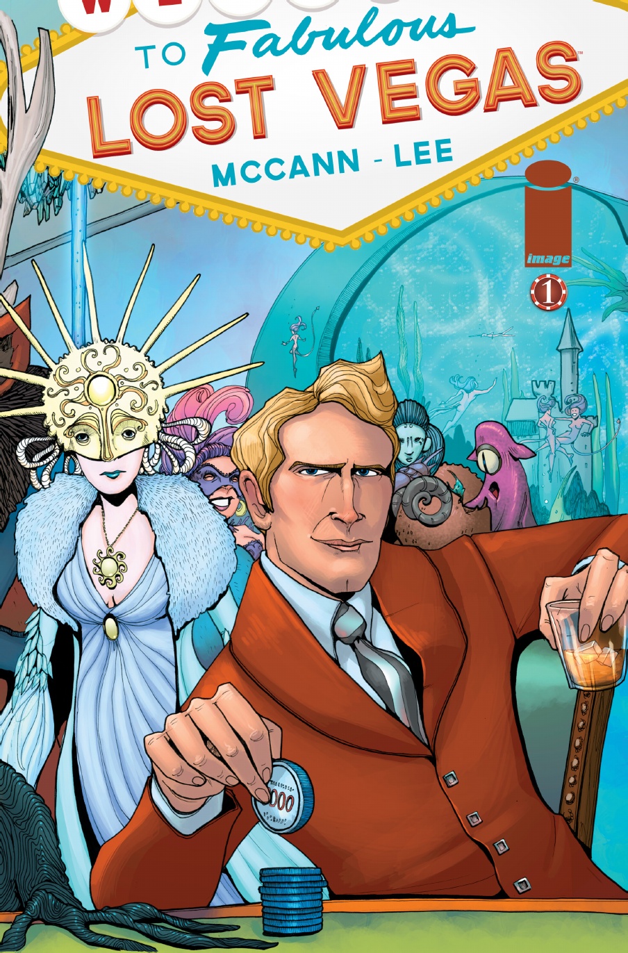
 Cover choice #1

Lost Vegas_1_A


"Best of the Week in Covers"  3/6/13 posted by Paul Mongomery on ifanboy.com voted the image above (drawn by Janet Lee) as his first "Best of the Week 3/6/2013" entry and wrote: "Note the steely poker face. Note, too, the spectacular shawl syle lapels, the square buttons of his rust orange jacket. I also enjoye the intimate hook of the first person perspective. We're the dealer or some opponent engaged in a very high stake game. I love a cover that poses a triple dog dare."
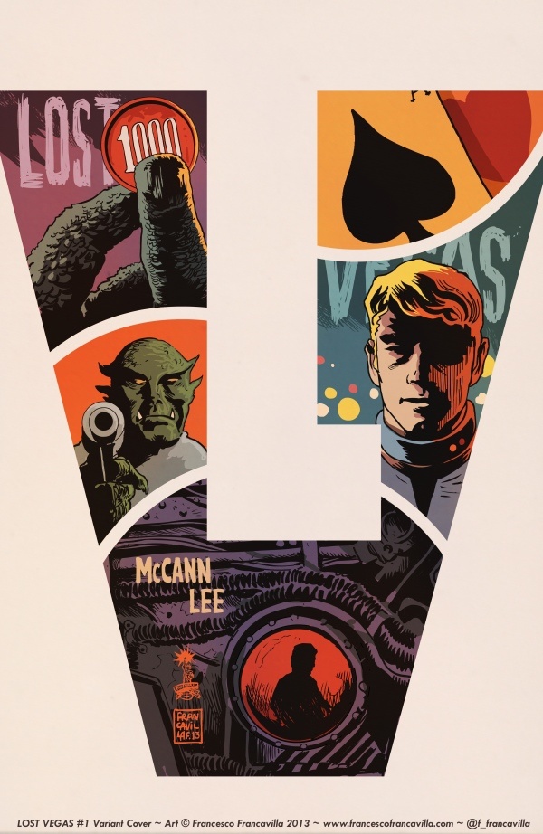
Cover Choice #2:
lost_vegas_01_cover_francavilla_low
Note this cover, drawn by Francesco Francavilla, was also voted 'The Week's Best' by Paul Montgomery in ifanboy.com's The Best of the Week in Covers - 3/6/13. Regarding this cover, Montgomery describes this as "An alien symbol with a vintage aesthetic. I imagine James Coburn in the lead role. Maybe Sheldon Leonard voices one of the whales. Grungy space jazz over a tram car chase, the camera canted at every turn. Turtle necks."

Cover Variant #3:

YoungVegas

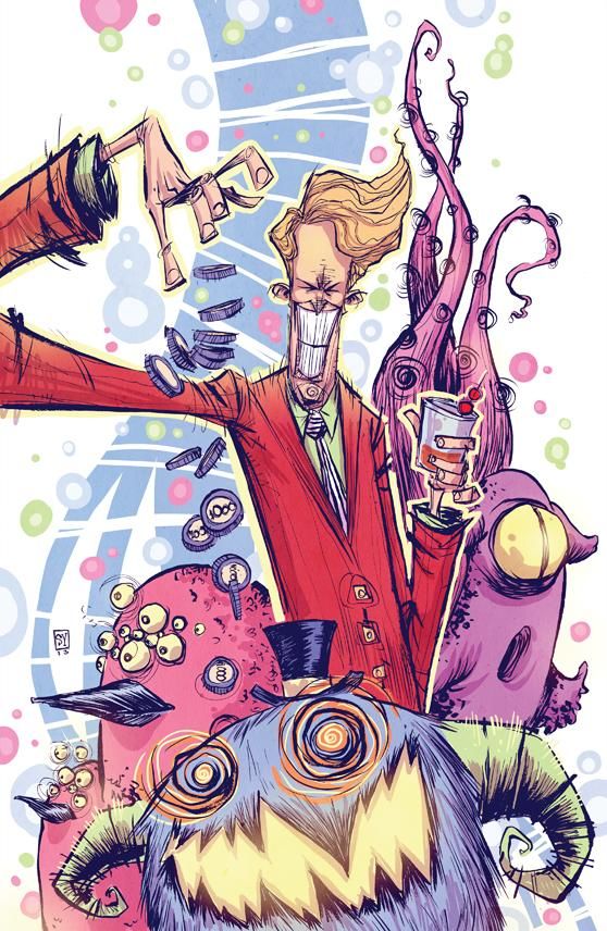
And Cover Variant "3 was also voted 'The Week's Best' by Paul Montgomery in ifanboy.com's The Best of the Week in Covers - 3/6/13.  This cover was drawn by Skottie Young and Montgomery notes that, "Young captures the delirium of the casino, the color and cacophony of the otherworldly pleasure palace. This is the height of frenzy, the buzz and hum of excess and fantasy. The heffalumps and woozies whose footfalls you don't fully register until the cold thud of the morning wake-up call."


Cover #4:

Lost Vegas_1_B

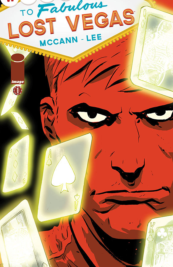
This variant cover was drawn by Dan McDaid and was ALSO voted 'The Week's Best' by Paul Mongomery in ifanboy.com's The Best of the Week in Covers - 3/6/13. In his post, Montgomery notes that, "Of all the covers, McDaid best translates Roland's anger. This is the aspect that landed him in that place of servitude and this is perhaps the only thing that will get him out of there. This is the cold fury under the skin of every disgruntled employee in the hospitality business."


So.... what cover do you like?...Have you read Lost Vegas yet?
Let us know in the comments.

In the meantime, thanks for your visit.  I hope to see you back soon.


Saturday, March 9, 2013

Infographics 101: What You Need to Know, Where to Find it, and Some Awesome Examples

From: Bethkanter.org


Information graphics or Infographics are defined by Wkipedia as:
"...graphic visual representations of information, data, or knowledge intended to present complex information quickly and clearly.  They can improve cognition by utilizing graphics to enhance the human visual system's ability to see patterns and trends."

History or Infographics:
 
It's not that infographics are new, they've been around for a long time.  Subway maps, weather maps, site plans, and graphs have been used for many years to visually relay weather paths, trends, and statistical data. Some might even date the first infographics to cave paintings and hieroglyphics. What is different now is the proliferation of free tools and social media websites that empower all of us to relay, send, and resend information quickly and efficiently, as well as proliferation of data detailing the effectiveness of visual images over verbal messages in terms of decoding speed, comprehension, and memory. 

According to Wikipedia (http://en.wikipedia.org/wiki/Infographic):
"The infographics created by Peter Sullivan for The Sunday Times in the 1970's, 1980's, and 1990's were some of the key factors in encouraging newspapers to use more infographics...Likewise the staff artists at USA Today...established the goal of using graphics to make information easier to comprehend.
By the year 2000, Adobe Flash-based animations on the internet had made use of many key practices in creating infographics in order to create a variety of products and games. Likewise, television began to incorporate infographics...[and] Kelly Shelton has widely been credited with the modern re-introduction of the infographic for marketing purposes. With the rise of alternatives to Adobe Flash, such as HTML 5 and CSS3, infographics are now created in a variety of media with a number of software tools.
Infographics are effective because of their visual element...Fifty percent of the human brain is dedicated to visual functions and images are processed faster than text...Furthermore, it is estimated that 65% of the population are visual learners (as opposed to auditory or kinesthetic), so the visual nature of infographics caters to a large portion of the population.
Infographics 101:

According to Wikipedia, there are essentially three components to infographics: visual, content, and knowledge.

The visual component consists of use of color, fonts, icons, and graphic design.
The content of infographics  typically consists of facts, research data and statistics.
The knowledge typically involves some insight or perspective relating to  the data being presented.

Furthermore, the  Wikipedia cites "three basic provisions of communication" that need to be considered and integrated when designing an infographic: appeal (it needs to engage its audience), comprehension (its information must be simply relayed to be quickly and easily understood), and retention (it should simply relayed and distinctly presented to be easily incorporated and remembered).

Interestingly and equally essential to effective communication, Aristotle noted three other vital aspects that should be incorporated into any message of persuasion:  ethos, logos, and pathos.

Ethos refers to the credibility of the message and messenger.  In order to be considered, there should be some reference to a reputable or known source.

Logos - for any communication wanting serious consideration, it must sound/look/appear to be logical or rational.

Pathos - the content of the message has to appeal to the emotional passions of its viewers.


While I have not (yet) endeavored to create my own infographics, in searching and researching infographics I found the following tools and websites to help create infographics:

Seven AWESOME examples of education-related infographics:

If you've been following or have visited my blog in the past, you may recall three other awesome infographics I've posted, one on the changing use of grammar by kids today The Ghost of Grammar Past, the importance of recess and its use and misuse in schools Good Grief 20 Minute Lunces and No Recess? and the other on Internet safety, Internet Safety for Kids: Growing Up in the Information Age.  

But, here are a few more:

Here is an infographic found at http://visual.ly/k-12-technology-usage using data from 2011-2012 on the use of digital tools and technology in used K-12 classrooms:  


This next infographic was found at http://www.adhdinfographic.com/ and visually relays information about ADHD:
 ADHD

 I found a number of infographics on the importance of breakfast but liked the one below best in terms of both graphics and content.  While I found it at http://pinterest.com/pin/48202658483896059/ I could not find the link to who created it.
  Breakfast changes lives. No Kid Hungry starts with breakfast. 

For those interested in the future of libraries, Open-Site.org created the following infographic (which I found at http://www.mediabistro.com/appnewser/the-future-of-libraries-infographic_b31564):
The Future of Libraries


Here is another really neat infographic detailing English word use and misuse.  It was developed by Grammar.net in 2011 and I found it at http://www.bitrebels.com/lifestyle/10-commonly-misunderstood-words/
misunderstood-words-in-english-infograhic


The next infographic relays how 21st century learning is changing (found at: http://www.educatorstechnology.com/2013/02/cool-gr
aphic-on-learning-in-21st-century.html)


The last infographic is from https://dl.dropbox.com/u/3138780/padwheel/assets/fallback/index.html  developed by Allan Carrington (University of Adelaide and first discovered on the website of Paul Hopkin's educational consultancy website mmiweb.org.uk).  It illustrates how different apps can be used at home or school to teach and enhance how to create, remember, understand, apply, analyze, and evaluate:


These were some of the infographics that spoke to me.  I hope they spoke to you too.  Feel free to leave links to your favorite infographics and/or comments about your experiences creating and using them.

Thank you for your visit and please leave a remark in the comments.


Monday, March 4, 2013

How To Read Graphic Novels

From: buzzle.com
For some people how to read graphic novels actually seems quite simple, but for many, it's not.


I did not grow up with graphic novels, nor would I allow them in my house.  It was my son and daughter who finally swayed me to read them.  They gently showed me that graphic novels were not just like the Archie comics I grew up with.  And because I didn't really grow up with graphic novels, it took me some time to comfortably read them.

Simply put, reading a graphic novel is a different experience from reading a prose text.

In this post I want to help the uninitiated...hopefully soon to be initiated...in the art of HOW to Read Graphic Novels and navigate sequential art stories. 

The story and plot are broken down and presented sequentially in individual frames called "panels." Each panel has a visual or implied boundary that contains a piece of the story. 

Here is a panel from Laika by Nick Abadzis (FirstSecond Books, 2007):


In this example,  the borders around the panels are thin black lines with white spaces (gutters) separating them.

Here is our original panel as it appears on page 143:

Often, panels are separated by space called 'gutters.'  These gutters allow the reader to briefly pause and integrate the sequentially presented information before continuing on while inferring what will happen next.
 
In graphic novels, the border shapes, lines and their respective gutters can be manipulated to help tell the story.

In another example from Laika, we see very different borders, used to depict a dream scene. [Note that the color scheme and panel borders are used to  help created the 'dream' image.] 


As you can see from the examples above color, font, text (found in balloons), images, and panel borders are all used and manipulated to tell the story.

Even text balloons differ to help tell the story.  Often thoughts are encased in wavy-lined balloons (with little bubbles arising from the subject thinking them), while the actual dialogue is contained in the traditional text balloons. Sometimes, the text balloons themselves will vary in shape to depict real versus imagined characters or to distinguish the present from the past.

In the example below taken from Joe Kelly and JM Ken Niimura's I Kill Giants  (2008), Barbara (the protagonist's) dialogue is in traditional text balloons, while the imp's dialogue is in a scalloped balloon.


IN SHORT:  Each panel element (color, text fonts, text balloons, panel shapes, panel borders, panel arrangement, and gutters) supplements the others and as such each element must be integrated panel by panel to tell the story.  

Typically, panels are read and arranged in rows moving across the page from left to right from the top of the page to the bottom of the page - much like you see in the sample pages above. There are times, however, when the authors/artists want to emphasize certain points and hint at others.  In such cases they may deviate from the traditional page lay-out.  In this sample page below from Tribes: The Dog Years (written by Michael Geszel & Peter Spinetta, art by Inaki Miranda, and Color by Eva De La Cruz; Soulcraft Comics, 2011) the author/illustrators decided to embed one panel in another.  In this way they show want is going on throughout the tribe (as the sun sets and hunters return) while at the same time emphasizing individual conversations.


While this slightly different panel arrangement clearly leads the reader where and on what they want the reader to focus upon, there is a risk that they misdirect the reader which will slow him or her down as they try to find their bearings again (in such cases the reader loses track of which panel to read next).  As a result graphic novel designers work very hard to make sure ALL the elements of the page work together to direct the reader in the appropriate directional sequence.

These are just the basics.  The best way to learn to read graphic novels is by reading them. For suggestions on great graphic novel reads for all ages, librarians are excellent resources as are some of the links below:

Year's Best 2012 Non-Fiction or Historical Fiction Graphic Novels
Graphic Novels and Critical Thinking: A Piagetian Application for the Classroom
Graphic Novels Meet Common Core Standards with a List of "Favorite" Suggestions
Young Adult Summer Reading: Lots of Choices and Places to Look
Laika...Space Dog
Heroes for All
The Very Best of 2011 Kids' Graphic Novels with Links and Excerpts
Visual Literacy and Reluctant Readers with a list of Graphic Texts and Graphic Novels
Reading, Graphic Novels, and Memory


 Let me know what your graphic novel experiences and favorites are, and feel free to leave your own 'how to read graphic novel' tips in the comments as well as any related questions.  
Thank you for your visit and comments.